Thursday 27 January 2011

U&LC

For one of my selected briefs I am putting together a newspaper based on typefaces, and anatomy of type. During my tutorial with Lorenzo he explained about something called U&LC, and looking at the work, it has some great piece of typography that can help me with the ideas I have in mind.

Here are a few images I found, through Google Images, of pages from the U&LC Book;

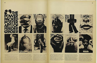
Looking at some of the images from the book, so piece stuck out to me, here is a double page spread, filled with unusual, but interesting images, combined with some nice bold san serif type.

Through the book it seems to have a double page spread showing existing past copies of the magazine. A nice addition and a nice bit of layout.


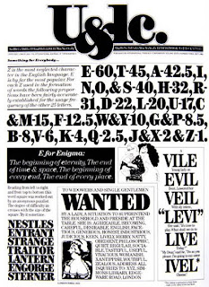
Nothing is kept the same with the designs, always doing something else, here showing a design of a house, made up of letter forms. A lovely piece of design, works brilliantly with the section of information to.


Combining multiple typefaces onto one page, and mixing up the sizes, it is hard enough to do and not make it look to out of place, but the designers here have done a job that is appealing to the eye and makes you look twice.


Pieces like this, a idea that is simple, but is a strong piece of design with a clever effect.


Here are three covers for the U&LC Magazines, with magazines its important to make it so its going to have some sort of instant impact, something to drag a audience in. Here they have designed it brilliantly, great logo, great use of text and image, and combination of the two.


I really liked this, the idea of using a letter and transforming it into a image, with such simple additions.


There is a U&LC Book, if it continues with the standards of design here, its gonna be well worth a look.

Layout Work, Reece Identity.

Over the past few days I have been working on a logo design for Reece Leung Photography.
It has been a bit of a pain, trying to keep the design simple, bold and to match his personality.
My limits have been keep the design black & white and to use just his initials RL.

I feel I have came along with a good set of designs, but from there it is just picking one, getting the best out of it that I can.
I am lacking on decision making once again, something thats needs to be changed quickly.
Just need to pick an idea, take it into Illustrator and even then I may be able to improve it from there.

I started with just doodling some ideas down, just messing about with san serif and serif type, no particular typeface, just drawing out letters. Messing about with combining upper & lower case together.


Was playing with combining the letters RL into one letter/symbol. Using the L has a leg of a uppercase R, as seen below, but have not yet seem to work, looks alot more like a PL.


I have tried the RL into a symbol in a few different aspects, and I have also messed about with shapes trying to make them work as the letter RL. Below is a design using the same shape twice, but rotated. I like that idea, using just one, and using it in different ways.


I came up with an idea of using serif typefaces, and combining the letters, but trying to make it clever, so the letters are sharing the serifs, the problem with this idea has been the designs are reading more as LR rather than RL. This is something I am going to mess about with though, because I feel it could work, and could work really well.


Once again, using just one shape or letter and rotating it for it to read something else.
I used a uppercase L, reflected an rotated it. The design worked out pretty well, because it now looks as if it something to do with camera, when you are looking through a lens and you see the focus, forms a similar shape.


The idea below, of the backwards R working with the L, I felt could work, but a few people mentioned it could come across as a 3? But thats from a drawing, so will have to take it into Illustrator and see what I can do with it.


Deconstruction, an just messed about with removing pieces of the R and seeing if it has an effect for the design, and I have removed a piece, so there is now an interesting shape formed, so I feel I could do something interesting with that, gonna take it into Illustrator and mess about with size and composition.


Although I do feel comfortable with the idea I mentioned above, I just feel I should carry on to see if there can be any more improvement.
messing about with 3D, wrapping around each other, not having as much effect.


Adding to Branding Briefs.

As I am putting together the branding/identity for two of my friends, Reece & Josh, who are both photography students, and I am also putting together something similar for my cousin Hayley Vaughan for her hairdressing company. As well as the pair of them I am also doing the branding brief for Carbon Offsetting, hoping that could open up some opportunities for myself.


Thursday 20 January 2011

Brief; Reece & Josh Identity

I have been asked by two of my house mates, Reece Leung & Josh Rose to produce their branding and identity.
I will be putting together a Logo, Business Card, Letter Head, Compliment Slip, and a creative CV. Along with these designs I will be putting together anything I can think of that could fit in with their identity.

I have made a start to Reece's design, I have started doodling, to put together Reece logo, he has told me I can do what ever I like with the designs but he wants it kept to a Black and White colour pallets.

As for Josh's identity, he has told me I can do what I want, and when I show him we can go through any bits and bobs thats could do with being edited to his taste.

I don't want to spend to much on these briefs, simple, quick turn arounds. So hoping I can have the designs done by 26.01.2011, and printed 27.01.2011.

More Workshop

To go with the last blog post, this is some extras I have just recently found on Workshops website.

Auburn;

A few addition from the last blog about Auburn,
Aswell as putting together the Branding/Identity for Auburn, they have also produced alot of their shop items, as you can see below they have put together the shop sign, so that is working on a lot larger scale.


Also producing smaller sized shops signs.


Counter designer.


Bags.


Street Signs.


Reason for showing all of this, just because I am doing a Identity doesn't mean it has to be limited to a Business Card, Letter Head and Compliment Slip, can range across alot of other things. Of course its different it is only for a client who doesn't own a shop, but it the chance of doing a brief that could need all of these items.

Van Zeller;

I came across this on Workshop's website, something I missed last time.
A more complexed piece by their standards, more for the eyes to look at, unlike their simple approach.


But along with the Identity they have also put together some other bits and bobs for the company. such as Gift Certificates and shop signs, some I can look into, and think about other items I can design for clients.