I finally got my logo designs from paper on to Illustrator. Some of them look very cheap, but I have put together plenty of ideas I am really happy with.
Below are the designs I came up with, some just taking a few tweaks and edits;
I had the idea of deconstructing the character "R" so it had more impact that your standard ''R''
I edited the ''R'' to how I wanted it, and started working with what goes around it.

I worked with having the ''L'' the same length as the ''R'' but I don't feel it has the impact that the others do with it being shorter, although Uppercase letters are the same size, don't feel this works.

Rotating the ''R'' made the design look a little different, but also a little better, so I thought this is something I could start to work with.

Little things make the design look abit stronger, example here being the full stop, just a simple add gives the design a little bit more.


I came up with the idea of not using a existing typeface, but to make the letters out of shapes. But sticking to the same idea, of the edited ''R'' cause feel that could really work.
This was the first initial design I came up with, and instantly thought it looked abit better than the other designs, but felt there is still something more that could be done to it.

I decided on trying out the idea of rotating the ''R'' and starting experimenting with different ways of working around the symbol.

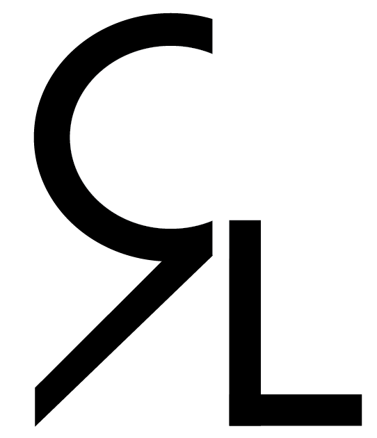
I levelled the ascender on the ''L'' to line up with the ''R'' and feel it works really well, nice, simple and neat.
Then came the idea of joining them together so it looks like a large symbol. It does work, but something is missing, So I continued to play about with the design.


Experimenting got abit much, cause this just doesn't work at all.

I thought of having the ascender raised up to the top of the uppercase ''R" with the symbol now have a full backwards are with a attached ''L'', something that could work.

This is the strongest design so far I feel, like the layout and how it is all attached. How you can notice the circles. The idea of the circles and the lines making the one symbol.


Starting to mess with raising bits of the letters to see if it has a changing effect. There is improvement, just not the greatest amount to change the whole design.

Tried the idea of filling in the filter, but simply didn't work.

I continued to experiment with little tweaks and changes to the symbol that I found I was happy with to see if I could change them to have a larger effect.

I simply added a full stop, and straight away I felt it had a large impact, when looking at the design I feel it spells out Reece.


Below, are a few ideas I put together but don't feel they had a effect that they could really.


Some of the design here work, but I know I am capable of producing better designs.
 The design below, I really like, but there is the possibility of people reading the initials as "PL" rather than "RL."
I had been working alot with San-Serif type faces, so I thought I would experiment on the side of Serif typefaces, see what I can bring together.


Although some of the Serif typefaces worked, I don't feel they had the effect that the San-Serif designs. Just looked a little cheap, could possibly work in different situations, but I don't feel they fit in, with the type of person Reece is.
No comments:
Post a Comment